iPad Lightroom vs Capture One (Travel Photography)
In this blog, I will compare Adobe Lightroom to Capture One for the iPad. I will be evaluating these as standalone apps, not as counterparts to the desktop versions. Please keep in mind that software changes frequently, so I will write new blogs every few years or whenever there are substantial changes. I will link any updated blogs here if available. At the time of writing (August 2024), both apps have received significant updates, and I am using iPadOS 17.
Use Case
I can only write this review from my own use case perspective. I travel frequently and, for most trips, I only bring my iPad. For months on end, I use the iPad as my main editing machine, only switching back to my laptop when at home. I only bring the Mac on extremely long trips or when I need a specific feature the iPad doesn’t have. I don’t treat the iPad as a supplementary device to the Mac but as a standalone laptop. I don’t shoot weddings or events, so the average number of photos I process from a day’s shoot ranges between 200 and 1,000. Although I have both apps, I spend 95% of my time in Lightroom because of Adobe Cloud, meaning I have access to my entire library. That said, I run a duplicate library in Capture One on the desktop to keep my finger in both pies. As it stands, Lightroom has more features, but more on that later.
Gear
This review is based on a top-spec 11” M4 iPad Pro with 2TB of storage and 16GB of RAM. I also use the Apple Pencil Pro and the Magic Keyboard. I did not opt for the nano-texture coating for the screen because I prefer to use a screen protector that can give the same (if not better) result. I use the Bellemond screen protector. Other gear includes an Anker USB-C hub and a Sandisk 4TB SSD for backup and storage expansion.
Options
Both apps are available as standalone subscriptions or as part of a larger subscription package that includes the desktop versions. Unless you work 100% on an iPad, I would suggest getting the package that includes the respective desktop apps. You simply get more for your money and more options/features. Adobe offers different storage plans, with the basic one including the iPad app, Mac app, and 1TB of cloud storage. I won’t discuss exact pricing here because it differs from country to country. If you hate the idea of subscriptions, then consider Affinity Photo, Pixelmator, Snapseed, and many others.
Intended Use & Concept
Although both apps theoretically do the same job, there is a significant difference in their concepts. Lightroom can be used as a companion to the desktop app but also as standalone software. It works well with a touch interface, a keyboard/mouse, and when connected to an external monitor. In fact, when connecting Lightroom to a monitor, you could be forgiven for thinking that you’re using a desktop app. Lightroom has its own extensive file management system with full cloud integration.
Capture One, on the other hand, is designed solely as a companion to the desktop app. It’s missing most of the key features found in the desktop version, and the cloud integration is limited to a small number of photos. In Capture One, the cloud isn’t for storing your library and accessing it anywhere; it’s for temporarily storing files and moving them from iPad to desktop. Another obvious difference is that Capture One is designed to be a touch-first interface. Put simply, Lightroom can be used for the entire editing process, while Capture One is more suited for backing up, culling, and making basic edits on the go before importing to the desktop to finish.
Performance & Usability
Both apps work well with no major bugs or issues. That said, I found Lightroom to feel more optimised, smoother, and quicker. Capture One sometimes feels a bit laggy. Lightroom also utilises screen real estate much better, while Capture One seems a little cluttered. Speaking of clutter, I find Lightroom to be much better organised and laid out. Anyone can pick it up and start using it right away; everything is intuitive and where you’d expect it to be. Capture One, however, requires more time to understand the layout and how to access all features. I sometimes find the menus in Capture One overlay on the photo, with no way to stop this or make the photo smaller, which I find distracting. Also Capture One does not support Split View.
Given the simplicity of Capture One’s cloud function, I never encountered issues with sync. Lightroom, on the other hand, can have sync issues, especially if the connection is weak or interrupted. This can result in not all files being synced, corrupt files, and a mismatch in the total number of photos between iPad and desktop.
Keyboard Shortcuts
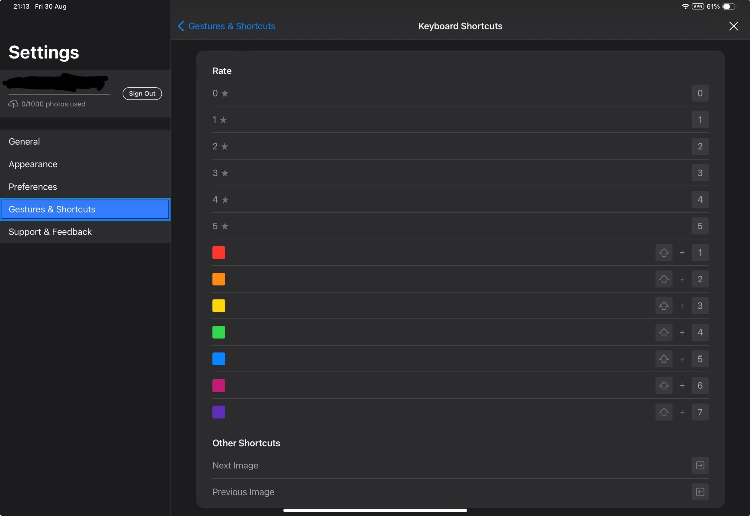
Capture One has very limited keyboard shortcuts, mainly for rating/tagging. Lightroom offers more shortcuts for functions like copy/paste, before/after, and much more. Both apps have significantly fewer shortcuts than their desktop versions, with no way to customise or add more yourself.
Learning
Capture One doesn’t have any significant aids for beginners apart from a user guide and support section, which is fairly comprehensive. Lightroom has an entire community section where others share their edits, providing a platform to learn from.
Library & Storage
This is another area where there is a significant difference in how the apps work. The only similarity is that both can work locally and have a cloud function. Lightroom revolves around the cloud, meaning your entire library—including presets, album structure, edits, and original files—is cloud-based. You can start working on your iPad and then pick up where you left off on your desktop, phone, or even using a web app. While this sounds seamless, upload times can vary drastically depending on your internet connection. The only limit to the cloud feature in Lightroom is your storage option, which can be increased up to 10TB, albeit for an eye-watering price. With Capture One, the cloud feature is limited to 1,000 photos and is designed as a way to transfer your initial selects to the desktop for further work.
When it comes to local storage, both of these apps have a major flaw: there’s no way to back up your library to another physical location. If something happens to the iPad or if the app corrupts and needs reinstalling, you could lose everything. Of course, there are ways to back up manually, but it’s more labour-intensive. I’ll discuss that later. If working locally, you need to be mindful of storage, and this is where Capture One pulls ahead by allowing you to store RAWs on an external drive and link them to the app for organising and editing. This means you can safely back up and process thousands of photos without clogging up your internal storage.
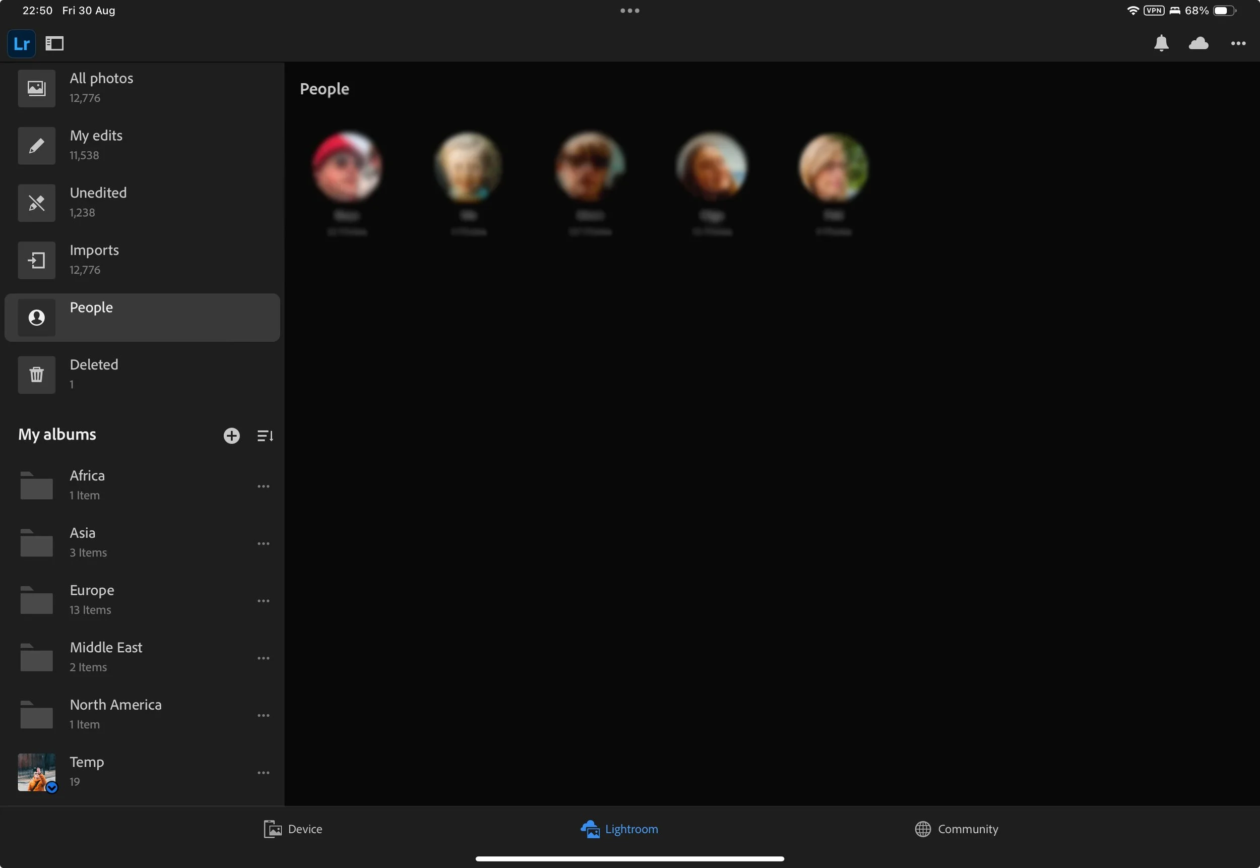
Lightroom has a People View that identifies faces and groups them into folders for each person. This can also be edited and modified manually. Lightroom allows you to store the RAW files in the cloud and keep editable smart previews locally to save space. These smart previews can also be exported as small JPEG files without needing an internet connection. You can also select specific folders for local storage and manage everything from the cloud settings. Capture one on the other hand, allows you to batch rename photos which is amazing for organisation.
Finally, Lightroom allows you to work directly with the Apple Photos library. You can import your RAW files into Apple Photos, create your library, and then edit in Lightroom. This isn’t the most seamless process, but it can work for some.
Importing, Culling & Organising
Both apps have a fairly basic import page; however, Lightroom offers more options. In Capture One, you have no control over the import, and everything goes into a generic ‘All Photos’ folder unless you import via the album that’s already made. From there, you need to move your imports into albums manually. Lightroom allows you to select which album to import directly while both apps allow you to separate photos based on the capture date. However, I wish both had more selection options, such as file type.
When it comes to culling, both apps allow you to use either a keyboard or touch interface, with a similar experience in both. Lightroom allows you to add star ratings and keywords, while Capture One lets you add star ratings and colour tags. Capture One also lets you apply ratings/tags to multiple photos and even copy/paste them, while Lightroom only allows rating one photo at a time. In Lightroom, you can create a folder structure with multiple libraries, folders, and subfolders. Capture One is limited to single albums.
Search
Lightroom includes an advanced search engine. You can search for keywords, the camera used, focal length, and even the subject of the photo. I suspect it uses some advanced AI to achieve this, as the feature is only available when you have an internet connection. However, when you are online, it’s a godsend. I can search for a photo of a cat in portrait orientation, and within seconds, it delivers. This is probably my favourite feature. Capture One has no search feature at all.
Tethering
Capture One has a fantastic tethering option that allows you to tether your camera via USB or wirelessly to the iPad and shoot directly into the app. It even lets you tether your iPhone. This feature is incredible for portrait or product photographers, especially in a studio setting. It allows you to make camera adjustments and review the photos on a bigger screen in real-time. Personally, I don’t use this feature much because I don’t do those types of shoots, but it’s a fantastic tool to have just in case the need comes up.
Presets
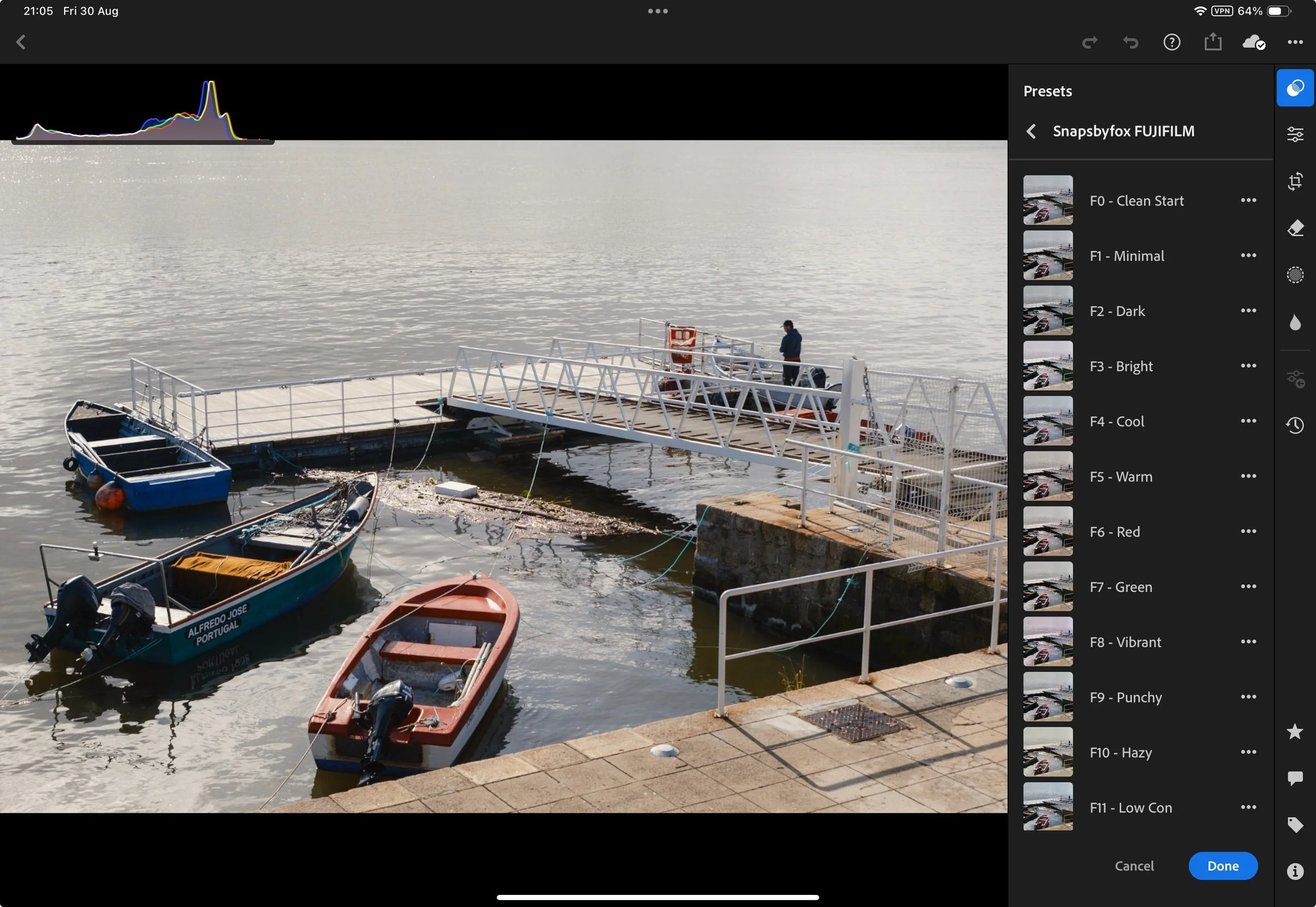
Both apps allow you to utilise presets. It’s worth noting that in Capture One, presets are actually called "styles." A preset in Capture One adjusts specific parameters of an image, such as boosting exposure by one stop. A style in Capture One works similarly to a preset in Lightroom, affecting every parameter that has been set.
Both apps allow you to create, import, and export presets; however, I feel Capture One has the upper hand. Capture One allows you to add more parameters into the preset, such as ratings and tags. Additionally, Capture One enables you to stack presets on top of each other, giving you a broader range of control and the ability to build your own look using a selection of different presets. Capture One has a better system for importing, organising, and exporting presets because it’s done via the Files app. Lightroom also has a great system for presets and allows you to save almost every setting.
The big advantage of Lightroom is its ability to sync presets to the cloud and have them available on other devices. Lightroom also makes it easier to update presets. Finally, there are simply more presets available for Lightroom than for Capture One, including free ones directly within the app.
Editing Tools
This section will focus on the tools you have access to and their operation. We won’t discuss differences in the RAW engine, as that topic is deep enough for a dedicated blog. Given the vast number of feature differences, I will list them below before providing my conclusion. The list will contain features that are present in the respective app but are not found in the other.
Lightroom:
Masking
AI Selection
Colour Grading Wheels
Auto Geometry
Auto Straighten
Lens Blur
HDR Photo Editing
Apple ProRAW Support
Advanced Grain Control
Advanced Geometry Control
Remove + Heal
Generative AI Remove
Versions
Capture One:
Viewer Frame Colour
Exposure Warning
Presets for Individual Adjustments
Levels Adjustment
Advanced Curves Adjustment (Picker)
Brightness Slider
There’s no getting around the fact that Lightroom has more editing tools and advanced AI features. In this department, Capture One is lagging behind by a substantial margin. For some people, Capture One offers everything they might need; however, for many photographers, I feel that Lightroom offers more editing features that they would use in their workflow.
Exporting
Both apps offer decent export options; however, Capture One is much cleaner and more concise. Lightroom’s export options are a little messy, if I’m honest. Although Lightroom does offer a few extra features such as output sharpening and colour space, I still find Capture One’s export menu to be superior. The one positive that both of these apps share is the ability to export the RAW file with adjustments. Adobe uses the DNG format, while Capture One uses EIP. This is handy for recreating your folder structure on an external drive and exporting files in this format for backup.
Summary & Recommendation
Although both of these are giants within the photo editing space, when it comes to their iPad apps, there is only one clear winner. Lightroom simply offers more tools, a better interface, and a superior library. The only reason one would choose Capture One is if they require tethering or if they use the desktop app for editing and the iPad for basic culling and edits on the road. If you plan to work solely on the iPad, Lightroom is the clear winner. Of course, all this could change in a year, and I’ve already read that Capture One plans to introduce full sync at some point too.


