Why Your Lightroom Presets Look Bad
You don’t have to spend more than 10 minutes in the photography space to come across Lightroom presets. Whether you make them yourself or you have purchased a bunch, you will in most cases have some saved in Adobe Lightroom or Camera Raw. When it’s time to use them, seldom will you come across presets that work as one-click edits. In most cases, you would need to tweak them to fit or even make major adjustments. However, sometimes no matter what you do, a preset just won’t look good. This could be because it’s a crappy preset or perhaps the type of photo you’re trying to edit isn’t well suited to that specific look. Despite all this, you have three main levers that can turn even the most mismatched and crap preset into something that works. While there are plenty of ways to get the job done, these three adjustments will have the biggest and quickest impact.

Exposure
Incorrect exposure can make or break a photo. Not only will it impact the core of how the image looks, but it will also have a huge effect on how colour grading is applied. This means a predominantly green preset might look yellow if the exposure is off.


What is correct exposure? This is where some people might disagree with me. Correct exposure is what looks good to you from a subjective level. Of course, you can use the histogram and set the exposure according to that, which is fine for technical photos, but for more creative looks, this isn’t the best approach. More often than not, cameras will underexpose bright scenes and overexpose dark ones.


First, determine if your image is dark or bright. A photo taken on the beach in the summer will most likely work better being a little overexposed. A photo from a dark alleyway at midnight will probably work better a little underexposed. If you’re not sure where to set the exposure, first set it so the histogram is in the middle and then overexpose until the highlights begin to clip, then pull back a little. Of course, you can use the other exposure tools to fine-tune this.


Another thing you can do is change the colour of the background in Lightroom. I personally have mine set to white because I like bright images. You can change it to black or grey if you wish. This helps maintain a more global reference to how the image looks overall.


Finally, while you can change the exposure once a preset is applied, it might be more beneficial to make that correction before you apply a preset. This is because you might find that with the correct exposure, a totally different look is more suitable.
White Balance
Whenever I apply a preset designed around one camera to a different brand, I almost always encounter white balance issues. This is because different brands balance colour differently. Fuji is warmer, Leica can be a little more magenta, and Sony can appear overly cool at times. The differences are not only between brands but also sensors.


Once the correct exposure has been applied, white balance is your next adjustment. Of course, if the balance is clearly wrong, correct it first, but in most cases, it would not be that drastic. What is the correct white balance, you ask? Well, just like with exposure, there is a technical and a creative answer.
The most technical approach is to use the picker tool and hover over an area you know should be grey. This is why grey cards are so useful when technically correct photos are a must. This will give you the most technically correct white balance, not the one that looks the best.

As Shot

Colour Picker
The second way, the way I do it, is to eyeball it and adjust it till it looks good and suits the mood / feel of the photo. This will depend on so many variables, the main one being your taste, and while I can’t say what categorically will look good, I can say to keep things subtle. It’s very easy to overcook it and end up with a muddy mess.

As Shot

Manually Adjusted
When you adjust the white balance, not only are you adjusting the overall colour shift but also how other edits interact with the new global colour. If your preset has a lot of reds in the shadows, then playing with the white balance can drastically alter how those shadows are perceived.

Original

Exposure Corrected

White Balance Corrected

Preset Applied - Corrected

Preset Applied - Original
Camera Calibration
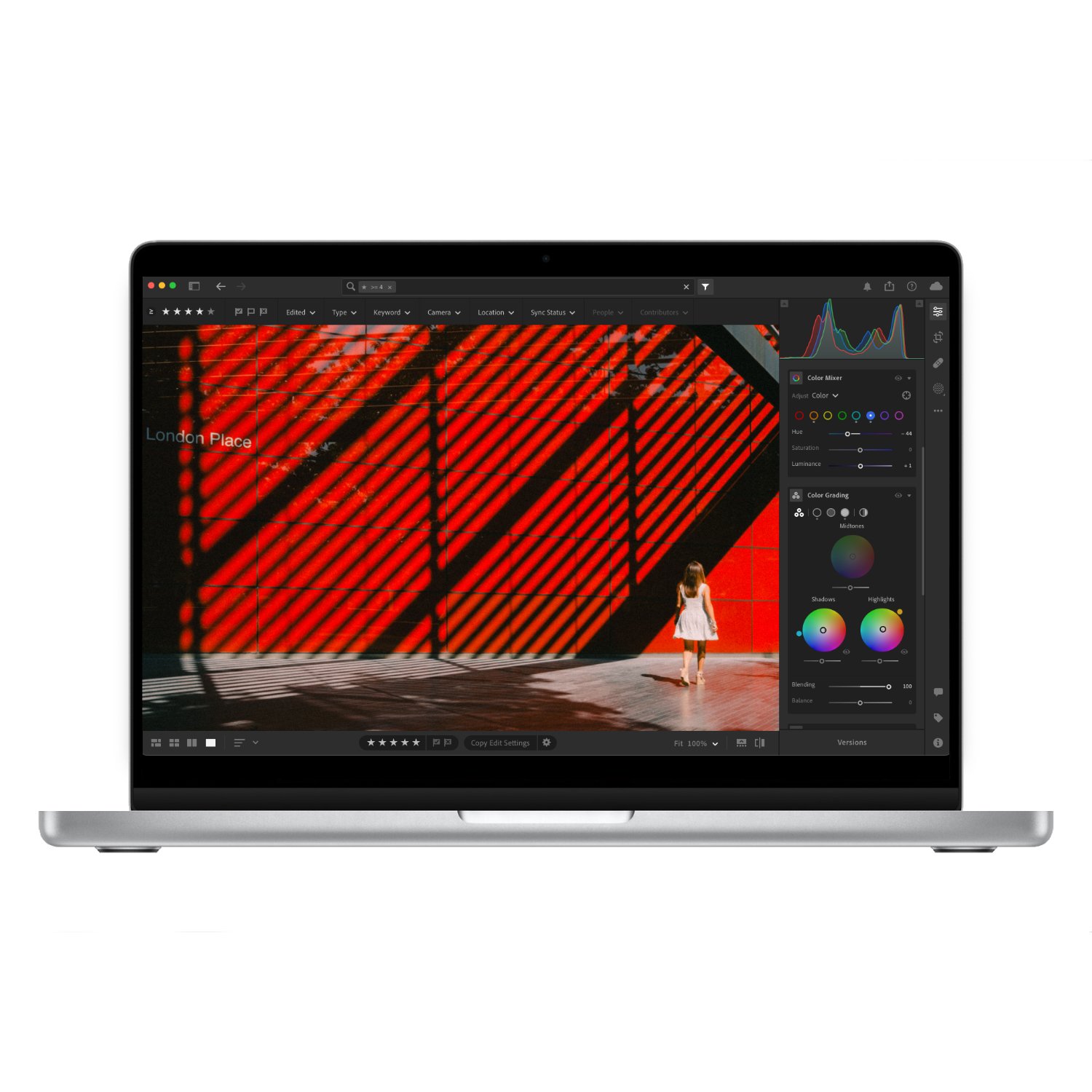
The final big adjustment you can make is with the camera calibration tool. At the time of writing, this is only available on the desktop version of Lightroom. While there are many ways to adjust colour, none are as unique as camera calibration. Instead of shifting colours, it impacts the very foundation of how the colour is made up. Camera calibration directly adjusts the RGB channels thus altering how each colour is perceived.
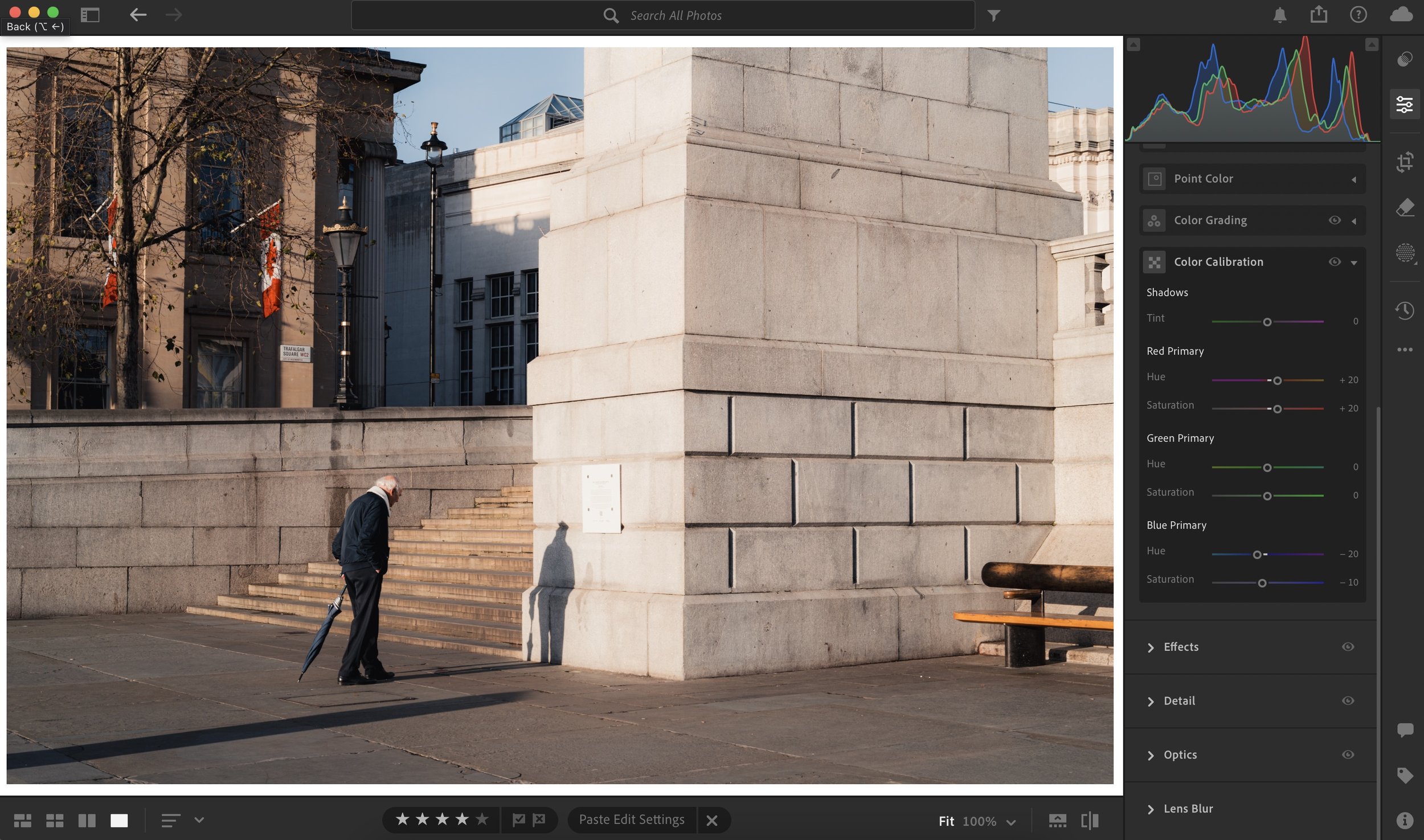

This is a fantastic tool for colour matching cameras or creating unique looks. I also use it to get rid of various colour casts or create hue shifts otherwise not possible. While this tool is not essential to create a great edit, it can be used to make bigger global adjustments to the entire colour palette of the image.


Setting the correct exposure and white balance will do 80% of the heavy lifting. Camera calibration will make the final few adjustments. While I can’t categorically say what adjustment you need, that would be impossible as I don’t know what image or preset you’re working with. What I can say is spend some time getting your head around this tool, it’s worth it.