Capture One vs Lightroom… Which One Is Right For You
In the world of photo editing there are two main giants. Lightroom and Capture One. They both have a dedicated following and offer plenty of features for everyone from beginner to pro. Over the last 5 years I have used both exclusively and in combination before settling with Lightroom. However in this blog I will share my honest thoughts on which one is right for you based on my personal experience. I will be comparing Capture One Pro with Lightroom. NOT Lightroom Classic. Lightroom classic is a dinosaur that I think will slowly die away. The normal Lightroom now has almost all the key features. On that note, this blog is being written in October 2023. Both of these are adding new features all the time so many things much change in a couple years or so.
Pricing & Updates
Originally the main attraction of Capture One was a one off payment for their software. However over time they have moved to a subscription model just like Adobe. They still offer a one off purchase option however it’s at a pretty inflated price that is only worth it if you plan to not update for a few years. Personally if I was solely using Capture One, I would have a subscription and always have the latest features. The Adobe model is the same as always. Over the years I have been paying attention to update cycles and types of updates. In my opinion I found that Adobe has overall added more useful features and optimised the software more than Capture One. As it stands in October 2023, the basic Lightroom package costs £120 a year and Capture One comes out at £180. They key thing to keep in mind is that the Lightroom package includes the iPad and iPhone apps. For Capture One it is extra…
Interface & Performance
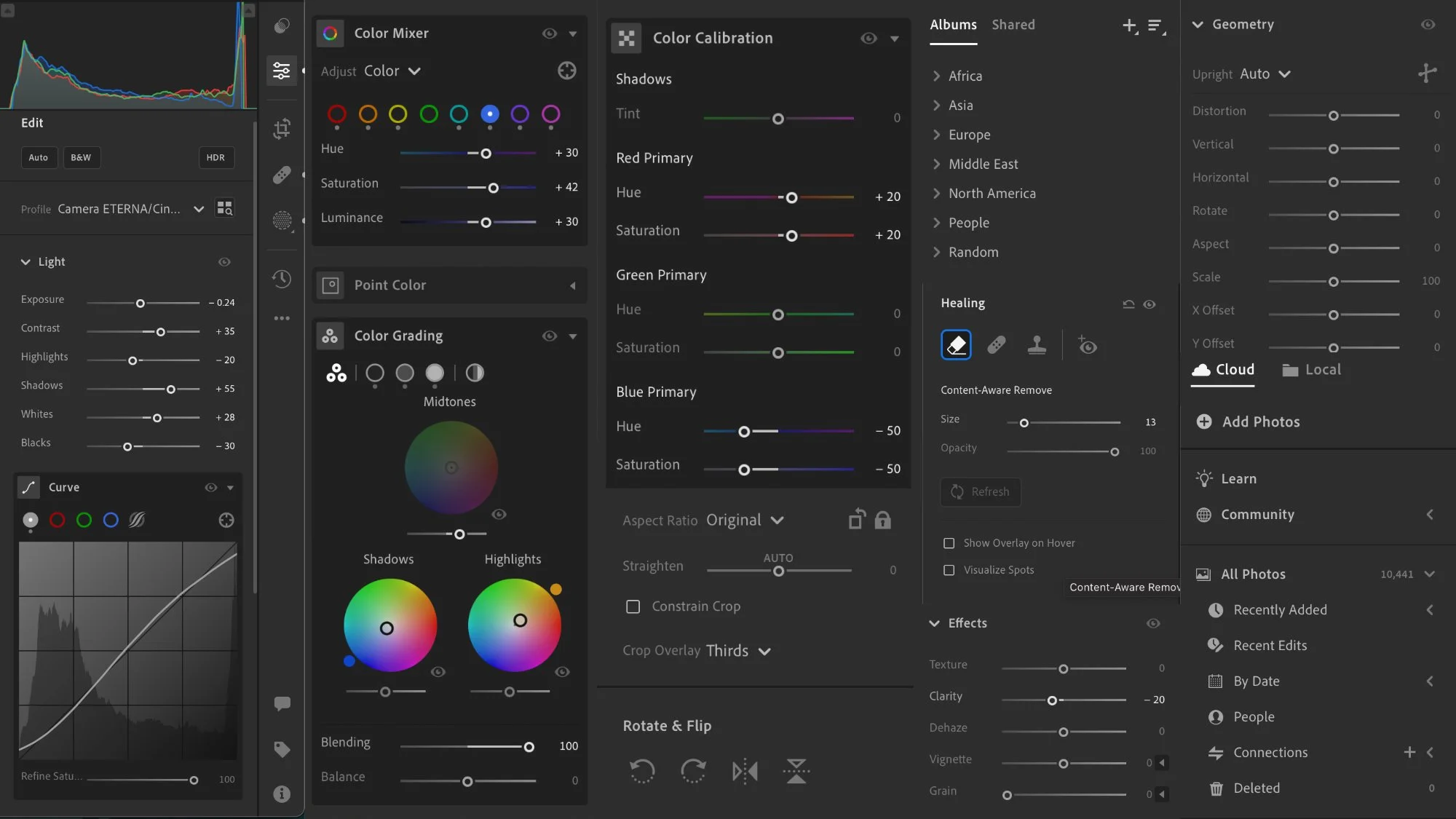
Lightroom still has the cleanest and simplest interface. It’s easy to navigate and gets out of your way. It’s very hard to get lost or confused and everything is pretty self explanatory. On the other hand Capture One has a very complicated interface that would need to be set up for individual needs and workflows. For beginners it can be incredibly overwhelming and confusing with a steep learning curve. However you can customise it to almost any layout you wish and make it incredibly powerful. On the other hand, the Lightroom interface offers almost no customisation whatsoever.
As for performance, I can only speak from an M2 MacBook Pro users perspective. I find Lightroom to be overall a little smoother and more optimised. Capture One seems to be a little more jerky and not as smooth. However Lightroom can bog down after long use and would need restarting to get back to normal performance.
Tethering
Capture One is still the king of tethering hands down. If you do any tethering whatsoever, Capture One is the clear and only choice.
Storage
Capture One is an old school editor where it can store files within a library or have a library reference files stored elsewhere. There is no cloud backup or storage at least now. There is some cloud functionality for the iPad app but that’s heavily limited. Lightroom is a full cloud library, meaning the entire library lives in the cloud. Lightroom also has an external storage option where it can reference files stored on an external drive like Capture One. The cloud option is incredibly useful as I will discuss in the next section. One big difference between the two is that in Capture One you can create multiple libraries and even sessions. In Lightroom you only have one library. This might or might not be a huge deal breaker depending on your workflow.
Devices
This is where Lightroom is years ahead. The iPad and iPhone apps have about 90% of the functionality with more being added all the time. You can easily use these apps as your main photo editors and catalogues. Furthermore you can access your library through Adobe’s online portal on any computer. I have used the iPad app as my main editor for over a year and know photographers who do all their editing on the iPhone app. The cloud system really is outstanding. Not to mention everything is seamlessly synced. On the other hand Capture One is still a long way behind. Their iPad and iPhone apps feel like they are still in Beta and are very limited.
Image Culling, Search & Selection
Capture One has a more old school approach to culling and selection although it does have some neat tricks like the AI based grouping of similar photos. Also Capture One simply has more ways for tagging photos such as with colours. However I personally find the basic system in Lightroom to be more than enough. I never needed anything more than flag, reject and a star rating.
Where Lightroom takes a huge leap is the search tool. You search for anything that might be within a photo and it will find it. For example searching dog will bring up dogs. Searching bus will bring up busses. Also you can easily start typing the focal length, camera make or lens and it will filter by that criteria.
Editing Tools
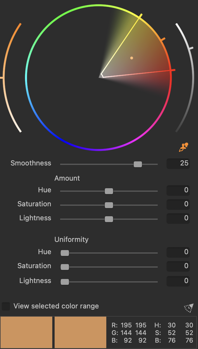
A while ago I would have said that Capture One had more advanced tools. It still does to a degree however Lightroom has been adding more tools that most people would actually use. For example the AI auto select tools are a huge time saver. The mask tools are great and now we also have point colour for precise colour selection. With all that said, Capture One still has more tools and more advanced ways of using them. Personally, one thing I wish would come to Lightroom is the layer feature. The skin tone selection in Capture One is great and I am sure would eventually come to Lightroom. One thing I wish Capture One had is the Camera Calibration tool… maybe one day. Finally Lightroom’s resolution, raw enhance and AI de-noise features are very good.
RAW Engine & Colour
This is the most subjective section and many might disagree however I find Lightroom to produce more pleasing tones and colours. I think Lightroom handles highlights much better and produces a softer and more pleasing result. Capture One is more clinical, clean and sharp. Not to say that is bad, for many commercial purposes Capture One might be better, I just personally don’t find the results very pleasing from an artistic perspective. It’s also worth mentioning I shoot in Fujifilm RAW and Apple ProRAW. For other files it might be different.
Lightroom
Capture One
Lightroom Strengths
Simple / clean interface and workflow. Has all the editing tools that most people would use. Amazing cloud sync and backup. Great iPhone and iPad apps with 90% of the features. Subjectively better RAW processing. Superior search functionality.
Lightroom Weaknesses
Lack of workspace customisability. You are limited to just one library for both on and offline. Locked into their system and monthly payments with no option of buying the software. Rubbish tethering.
Capture One Strengths
Advanced editing tools, layers and workspace customisation. The only real tethering choice. Ability to purchase without subscription. Ability to create multiple libraries and sessions.
Capture One Weaknesses
No online backup or storage support. Mobile apps are heavily limited. Interface can be extremely overwhelming and would require customisation. Can feel a little clunky to use. Lacking AI features like subject or sky selections. RAW processing can be too clinical (subjective).
Lightroom > Capture One
Lightroom is a better choice for most people especially those who like to work on the go and have their library available online. Lightroom has an easier interface and more useful tools for most people. I find that it is much quicker and easier to get to an end result I am happy with in Lightroom compared to Capture One. If you like to work on an iPad or iPhone, Lightroom is the only choice really.
Capture One > Lightroom
Capture One is better suited to freelance professionals who tether and shoot commercially. It has more advanced features that only a small fraction of photographers would need. It has a very extensive and customisable workspace that can be adapted to different scenarios. Finally the ability to create multiple libraries and sessions lends Capture One to commercial use.


